

What are Responsive cards in Bootstrap with CSS Styling | Bootstrap
What are Responsive cards in Bootstrap with CSS Styling | Bootstrap
Introduction:
Developing a webpage there are certain elements that are very much useful for the layout and the UI of the page. Creating a card-like structure to display pictorial and text information is used widely. The Bootstrap provides some classes which form cards with built-in CSS and JS functionality. It is not only well designed but also gives us some responsiveness for desktop and mobile view.
Pre-requisite:
Make sure that you have linked CDN of Bootstrap with its CSS and JavaScript files. It can also be done by installing Bootstrap through package managers or downloading the whole file then linking it to the document.
Methods:
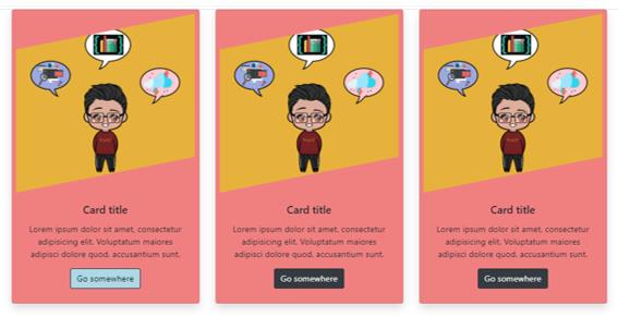
In the HTML file produce a class .container which will have the cards. Inside that container mention a class .row. This row class will have several columns having cards in each. Rows and columns can be made according to requirement, keeping in mind that maximum columns can be 12 in a row.
Inside the .row class mention three .col-md-4 classes. This will make three columns occupying four spaces with a break point of md. This will help the cards to be more responsive.
Inside each columns, create a .card class which will act as a wrapper for all the element inside this class. Start putting elements inside the card class:
- .card-img-top: Use this class to provide an image to the card.
- .card-body: Use this class to provide texts and other elements such as buttons, icons and more inside the card body.
- .card-text: Use this class to provide text to the respective card.
- .btn: Use this class to generate button inside the card.
All these classes have some predefined CSS which makes it easy to use and implement in the file.
There can be some additional classes which can be used to make the card look better and positioned better, such as .shadow class to put some shadow to the cards, with this we don’t need to have addition CSS written to produce shadow for the cards and .text-center class to align the elements which are wrapped inside this class to the centre.
We can also use some CSS to make the cards look attractive and better.
Example:
.btn:hover{

    background-color: lightblue;

    color: #000000;

}


.card{

    background-color: lightcoral;

    padding: 2%;

}


.card-img-top{

    clip-path: polygon(0 20%, 100% 0, 100% 80%, 0% 100%);

}
Code:
<div class="container">

      <div class="row">

        <div class="col-md-4">

          <div class="card shadow">

            <img

              class="card-img-top"

              src="/mybest_capture_2020-05-03 12_59_22.jpg"

              alt="Card image cap"

            />

            <div class="card-body text-center">

              <h5 class="card-title">Card title</h5>

              <p class="card-text">

                Lorem ipsum dolor sit amet, consectetur adipisicing elit.

                Voluptatum maiores adipisci dolore quod, accusantium sunt.

              </p>

              <a href="#" class="btn btn-dark">Go somewhere</a>

            </div>

          </div>

        </div>

      </div>

 </div>
Output: