


Responsive Image Slider – carousel Bootstrap | BootStrap
Responsive Image Slider – carousel Bootstrap | BootStrap
Introduction:
The image slider works profoundly to give a very good touch to websites. It works best on a project or product-based page. This enables the visitor to view a series of images as in a slide show. In bootstrap, it comes very handily to perform the image slider or image carousel for a webpage.
Pre-requisite:
Installation of Bootstrap should be done. There should be knowledge of some responsive and image classes. A little bit of CSS is required to be known. Some classes for captions and heading should know which will be used.
Methods:
The whole image slider or image carousel is to be wrapped inside the class name .carousel slide and it should have an id that will be used to navigate and move the images inside the carousel. Along with it, there is a need for data-ride and data-interval these are used to specify the carousel mode and speed of sliding respectively.
Inside this there will be three sections:
- One will have the list of carousel slider from where to be navigated
- The second will have all the elements required inside each slider and it will be linked to the list.
- The third one will be the controllers for the image or for the carousel to navigate.
The list of carousel slider will be targeted to the id tag of the wrapped division. Along with it will assign every slider with some values (numeric) and an active class for the image to be displayed on the home page in the first load of the webpage.
The section where the elements to be laid out will have an IMG tag for the image and a class of carousel-caption which will have the texts needed to be displayed as a caption for the sliders. All of this will be wrapped inside the carousel-item class. To make the images responsive and take the whole width, classes like d-block w-100 can be used.
The last section will have the controllers with the previous and next icons. This will be inside a tag with linking to the id tag of the parent division id tag.
Code:
<div id="myCarousel" class="carousel slide" data-ride="carousel" data-interval="3000">
<ol class="carousel-indicators">
<li data-target="#myCarousel" data-slide-to="0" class="active"></li>
<li data-target="#myCarousel" data-slide-to="1" ></li>
<li data-target="#myCarousel" data-slide-to="2" ></li>
</ol>
<div class="carousel-inner" role="listbox">
<div class="carousel-item active">
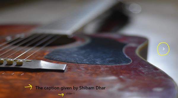
<img src="./andrew-neel-cckf4TsHAuw-unsplash.jpg" class="d-block w-100">
<div class="carousel-caption" style="color: black;">
<h3>Shibam wrote this article</h3>
<p>slider-1</p>
</div>
</div>
<div class="carousel-item">
<img src="./kobu-agency-67L18R4tW_w-unsplash.jpg" class="d-block w-100">
<div class="carousel-caption" style="color: black;">
<h3>Shibam wrote this article</h3>
<p>slider-2</p>
</div>
</div>
<div class="carousel-item">
<img src="./img1.png" class="d-block w-100">
<div class="carousel-caption">
<h3>Shibam wrote this article</h3>
<p>slider-3</p>
</div>
</div>
<a href="#myCarousel" class="carousel-control-prev" role="button" data-slide="prev">
<span class="carousel-control-prev-icon" aria-hidden="true"></span>
<span class="sr-only">Previous</span>
</a>
<a href="#myCarousel" class="carousel-control-next" role="button" data-slide="next">
<span class="carousel-control-next-icon" aria-hidden="true"></span>
<span class="sr-only">Next</span>
</a>
</div>
</div>Output: