


Deep Dive Into PowerBi |Some Points that Really affect Your Dashboard?
The previous article of this series was about How to clean our data in PowerBi. If you want to read the previous article click on link
In this article, we will look at some important points to make your dashboard interactive and attractive. In this article, we will look at some important points to make your dashboard interactive and attractive. This is very important for every PowerBi developer
Let's start
In the last few months, I do search on the internet to get shortcut or trick but I upset, guys there is no such trick to make our dashboard attractive. But some point that I experienced when I was developing dashboard for my clients
In this article, we will focus on those points......
The Points are
- The first point is, the cleaning of data is much important. Because clients only look at important and appreciate data that meets his/her requirements, so before start development think about cleaning of data
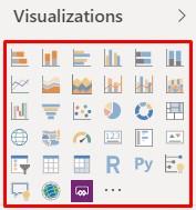
- Second Point is, select right visuals to plot data on it because there are so many visuals available and they work differently and this point is really helped you guys, you experience it.
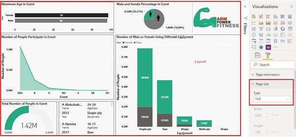
- The third point is, before start development. Figure out the size of the page and also think about the layout. It would be very helpful to make your dashboard attractive
- The fifth point is, always keeps in your mind to find out facts and dimensions in your data that really help you guys whenever you visualize your data
Facts- meaningful value column is always fact because they used as a value in your visual. Like price, cost, expenses, sold the unit, etc.
Dimensions- every column that has less repetition of the same value is dimensions. Like Country, region, year, category, etc.
note- it would depend on the situation what is fact or dimensions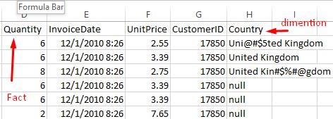
- The fifth point is, choose always the right color combination and font family. Because attractiveness of your dashboard really depends on it (use that kind of color combination)

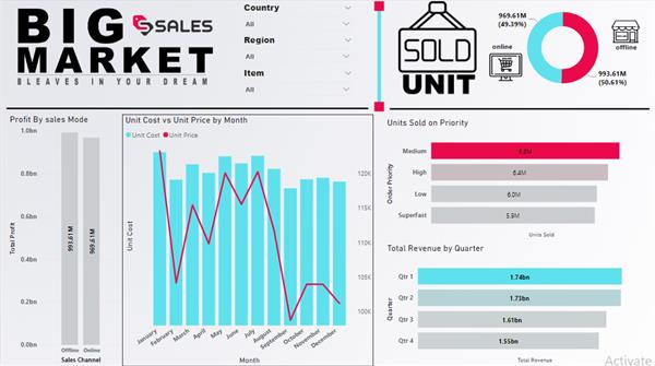
I show you guys my dashboard that created using above all points