

FORMS 2.0 IN HTML5 | HTML5 TUTORIAL
A FORM is a container of various other controls like text boxes, buttons, radio buttons, etc. which contains certain kinds of information and this information is carried to the concerned destination when a submit button is clicked. FORMS 2.0 is a successor of Forms available in HTML 4. But Forms 2.0 comes with some additional features. HTML5 contains various new types for the forms which are datetime-local, date, time, week, month, year, email, range, number, and many more.
In HTML4, we had a variety of types for input tag which are as follows:-
- Text:-The text types provide a single-line textbox on the webpage. This field allows the user to add various inputs within the webpage.
- Textarea:-The text area is very much similar to a textbox but the only difference is that it can be understood as a multi-line textbox whereas the text type provides a single-line text box. An important point to note is that <textarea> is a tag with attributes ‘rows’ and ‘cols’ which requires values to be provided to it.
- Password:-This type is used to provide sensitive information like passwords as input within the textbox. As a result of which, the characters of the password are hidden and displayed as asterisks (*).
- Checkbox:-Checkbox is used when we have to select options from a number of options provided on the form. The user needs to tick the relevant options on the form.
- Radio:-Radio refers to the radio button. The radio button is quite similar to the checkbox. But the former enables the user to select only a single option and latter allows the selection of multiple options. If we want to allow the user to choose multiple options then we need to provide exactly the same names to the type ‘radio’ while writing the code for the varying options.
- Button:-The type button is used to add a button on the webpage. The functionality of the button can be controlled by Javascript.
- Submit:-The type submit is used to add a submit button on the webpage. For example, submitting current form data.
- Reset:-The type reset is used to add a reset button on the webpage for resetting the form data.
In HTML5, various new types for <input> tag are as follows :-
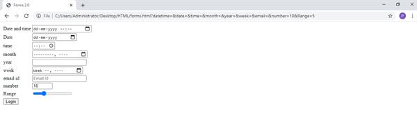
- Datetime-local:-It is a value for the input attribute. This type allows us to select the date (including day, month, and year) from a calendar and time from the control appearing on the form.
- Date:-It is a date picker that allows the user to choose the date in dd—mm—yyyy format.
- Month:-The month type allows the user to choose month and year from the box appearing on the webpage.
- Time:-The time type allows the user to choose a time in hours: minutes format.
- Week:-The week type allows the user to choose the week number and year
- Email:-The email type allows the user to enter the email id in the textbox. If the email id is not entered incorrect form then a message is popped.
- Range:-The range type allows us to add a slider on the webpage. We need to provide a maximum and minimum numerical value in the max and mix attributes to indicate the corresponding position of the slider.
- Number:-This type allows us to add a single numerical value within the box. We need to provide a maximum and minimum numerical value in the max and min attributes to indicate shuffle over the various range of values within a limit. It is a type of spinner to spin between numbers.
- ColorThis attribute allows us to add a color picker on the web page without writing the complex Javascript code. This way we can choose from a variety of colors and give them as input.
For example <input type=’color’ name=’colorpicker’>
Here Color is the type and the color picker is the name given to the control for javascript purpose.
Web Form 2.0 Attributes
- Placeholder:-Placeholder is an attribute introduced in HTML5 which could be used with <input> tag. It reserves a space inside a box for some characters. A text appears inside the box which is hidden as soon as we enter even a single character into the box. The value of the placeholder attribute specifies the types of expected input to be entered into the box.
- Autocomplete attributeAutocomplete attribute of <input> tag show suggestions based on the history of the browser and previously mentioned inputs by the user. This attribute takes the same ‘autocomplete’ as value
- Autofocus attributes autofocus attribute of <input> tag automatically blinks the cursor on the webpage to a specific location shown on the webpage. This way the focus occurs on a particular control. The value of the attribute is provided as ‘on’ or ‘off’ depending upon the situation to on or off the autofocus feature.
For eg.
Email Id<input type=’text’ name=’textbox1’ placeholder=”Email Id” autofocus=’on’ autocomplete=’ autocomplete’ />
Let’s go through the below code to understand the above types better.
<!doctype html>

<head>
<title>Forms 2.0</title>
<body>

<form>
<table>

<tr>
<td>Date and time</td>
<td><input type="datetime-local" name="datetime"/><br></td>
</tr>

<tr>
<td>Date </td>
<td><input type="date" name="date"/><br></td>
</tr>

<tr>
<td>time</td>
<td><input type="time" name="time"/><br><td/>
</tr>

<tr>
<td>month</td>
<td><input type="month" name="month"/><br></td>
</tr>

<tr>
<td>year</td>
<td><input type="year" name="year"/><br><td>
</tr>

<tr>
<td>week</td>
<td><input type="week" name="week"/><br></td>
</tr>

<tr>
<td>email id</td>
<td><input type="email" name="email" placeholder="Email Id"/><br></td>
</tr>

<tr>
<td>number</td>
<td><input type="number" min="0" max="20" step="2" value="10" name="number"/><br></td>
</tr>

<tr>
<td>Range</td>
<td><input type="Range" min="0" max="20" step="1" value="5" name="Range"/><br></td>
</tr>

<tr>
<td>
<input type="submit" value="Login"/><br>
</td>
</tr>

</table>
</form>

</body>
</head>
</html>
OUTPUT